The folks at Agile Austin invited me to present at the Product and AI Special Interest Group in July 2024. The subject was "How Does This Data Make Me Feel?", which I wrote about in this blog post.
Synopsis
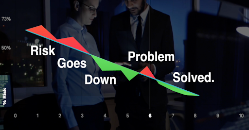
With the project schedule forecasting engine I developed in 2016, I found myself having to spend hours upon hours trying to train the clients how to use the software. It was difficult to understand at a first glance, too many widgets needed to be used, and required "slow thinking", which undermines user-friendliness. While offering a calculation of risk of failure or successfully meeting project deadlines, the context of the data (good or bad) was not being taken into consideration. After trial and error, we developed another chart, while an improvement, it was still not user-friendly. We hired a UX firm out of Austin to help develop a system which allowed people to use "fast thinking" to understand the data presented. When creating AI software, it is important to make the information easily and quickly understood by the client with little training.
Conclusion
Providing intuitive visualizations and actionable insights out of comprehensive data is challenging. Our success came from joining the power of an AI algorithm, psychological principles, intuitive visual design and embracing human decision making.
If you’d like help, we love creating insightful and intuitive AI and data systems, just ask us.